UX/UI Design
Projects
Cube Space
Fostering Access to South African Art
Cube Space is an innovative application aimed at enhancing access to South African art. Through the utilization of tools like Figma for wireframes and prototypes, Miro for mapping and data organization, and Lookback for user testing, Cube Space fosters an inclusive platform for exploring and engaging with diverse artistic expressions.
Problem Overview
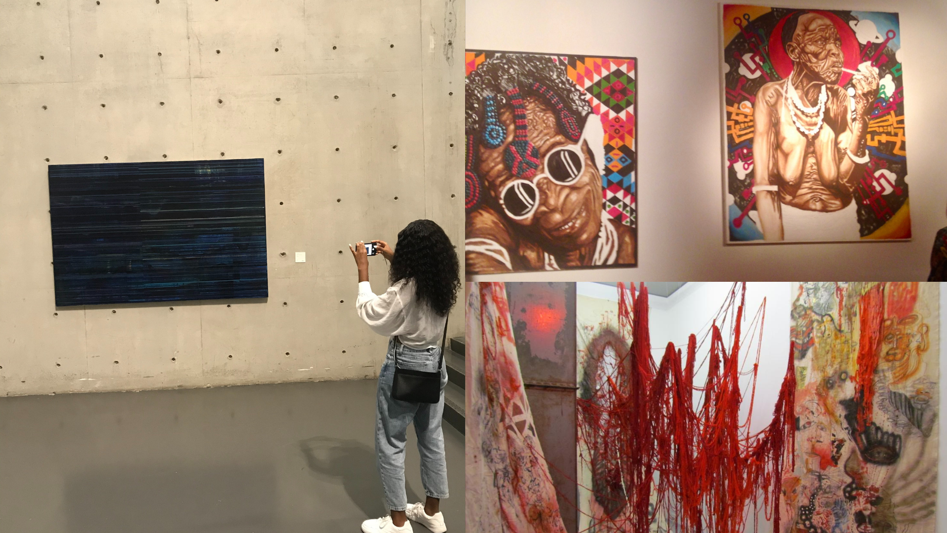
Art galleries serve as vital hubs for fostering creativity, inspiration, and therapeutic exploration. Nonetheless, they often present challenges for individuals with an interest in art, especially those lacking extensive knowledge, particularly in the context of South African art.My primary objective with Cube Space is to transform this landscape into an inclusive platform, ensuring accessibility for all users. I strive to curate a cohesive and immersive gallery experience, offering comprehensive insights into the rich tapestry of South African artworks showcased within the space.


Discovery: Research & Analysis
- Key findings during the initial stages of my research were that there is a lack of documentation and information about South African artists.
- For some, art galleries are gatekeeping and exclusionary spaces that impact experience in a negative way.
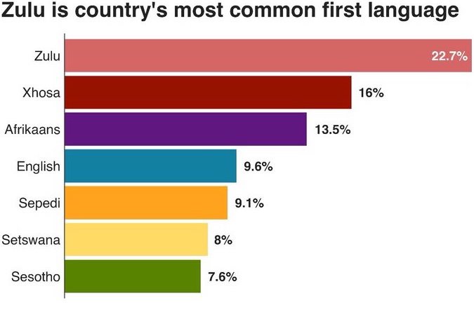
- English as the only medium of instruction in a country with 11 official languages is problematic because it excludes a large demographic that wishes to enter the space.
- Participants expressed that they would go to gallariess more often if there was more information about what they were looking at.
- Most participants go to galleries to socialize and would feel more confident conversing with others if they had accessible information of the artwork they were viewing.
Design: Concepts & Sketching
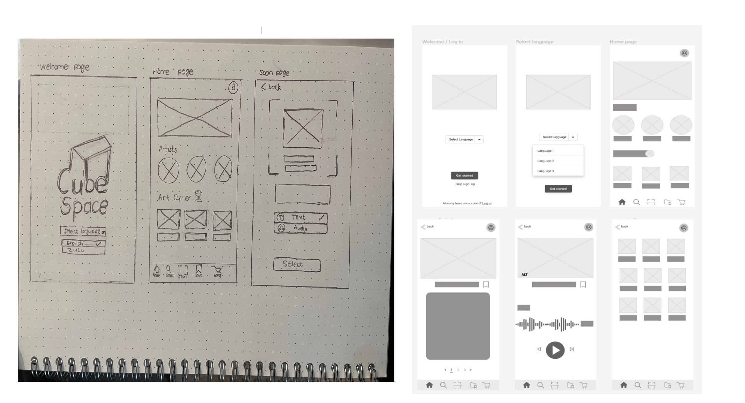
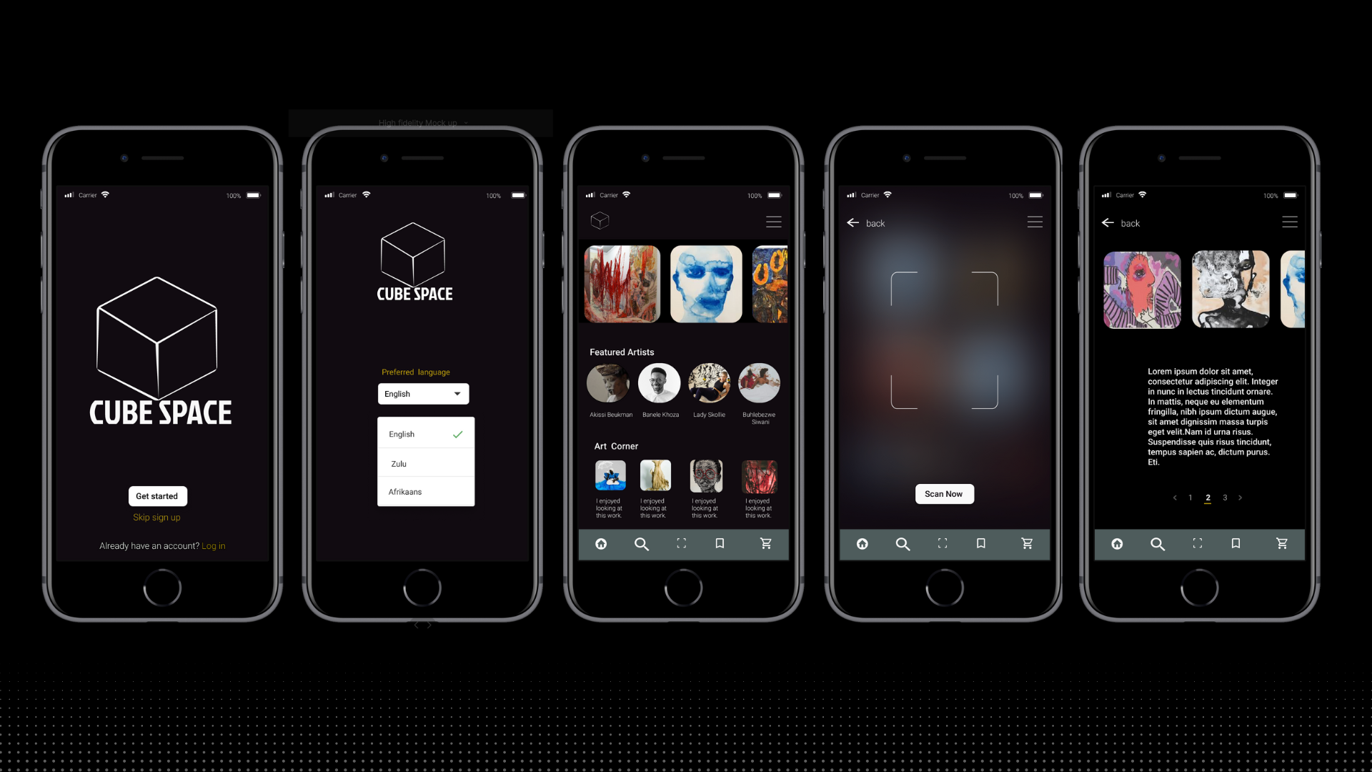
- To address issues raised in the key findings,, the application has comprehensive information about local artworks and artists exhibited in Cube Space Gallery by scanning the image they want to know more about.
- For accessibility, users had the option of choosing a language they preferred.
- For accessibility purposes the users have an option receive information in preferred format, text or audio.
- To encourage social engagement and discourse, users where provided with an “Art Corner” where they can share thoughts and leave reviews about the artworks they have seen with the rest of the art community in the Cube Space application.


Development: Prototyping, Testing & Usability Feedback
- 80% of users did not want to sign up, which compromised the retention rate.
- 20% of users clicked on the artwork to scroll.
- Most users were curious about purchase button.
- Most users selected the text format option.
- Users completed tasks successfully with minor errors and were able to traceback their steps
Solution & Impact Overview
- Created a strong call to action button to convert a user into taking the intended action.
- Users need to sign up if they want to access information they saved during the gallery visit. Users linked to sign up page.
- Users need to sign up when they want to access or interact on the art corner. Link to sign up page.
- The non signup method will only be limited to scanning and accessing information about art/artists.
The Cube Space prototype is available on Figma.
.png)
Let's Get Quizzical
Unlocking Knowledge, One Question at a Time
Let's Get Quizzical is immersive web-based platform designed to delve into the realms of history, art, and music, offering an enriching learning experience. Beginning with the inception of the idea, I meticulously crafted the prototype using Figma, ensuring a seamless and intuitive user interface. I Developed the app in HTML, React, and Bootstrap to bring the vision to life, focusing on user-centric design principles to optimize functionality and accessibility.
Problem Overview
This initiative was created when as an ESL educator in Asia, where I encountered the challenge of engaging teenagers in the classroom and facilitating their active participation in the learning process. To address this, I created a dynamic solution in the form of an interactive quiz application, developed to ignite interest and spark healthy competition among students. This was an impactful project as it increased student engagement, reading comprehension, and overall participation in the learning journey. By transforming traditional review sessions into captivating quiz experiences, students embraced the opportunity to reinforce their understanding of key concepts while enjoying a sense of camaraderie and excitement in the classroom.